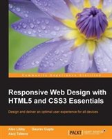
Responsive Web Design with HTML5 and CSS3 Essentials

Responsive Web Design with HTML5 and CSS3 Essentials

EnglishPaperback / softback
Libby Alex
Packt Publishing Limited
EAN: 9781783553075
On order
Delivery on Monday, 10. of August 2026
CZK 660
pc
Do you want this product today?
Megabooks Praha Korunní
not available
Librairie Francophone Praha Štěpánská
not available
Megabooks Ostrava
not available
Megabooks Olomouc
not available
Megabooks Plzeň
not available
Megabooks Brno
not available
Megabooks Hradec Králové
not available
Megabooks České Budějovice
not available
Megabooks Liberec
not available

Detailed information

Design and deliver an optimal user experience for all devices About This Book • Get to grips with the core functionality of RWD through examples • Discover how to make layouts, content and media flexible, and explore why a content-first approach is more effective • Maximize the performance of your web pages so that they work across all browsers and devices irrespective of the screen size Who This Book Is For This book is for web designers who are familiar with HTML and CSS, and want to begin with responsive web design. Web development experience and knowledge of HTML5, CSS3 is assumed. What You Will Learn • Explore various layout options • Understand what can be achieved in the browser, without the use of third-party tools • Executing media queries to benefit responsive designs • Understand the basics of responsive workflow and boilerplate frameworks • Improve performance of responsive web design • Maintain compatibility across various browsers In Detail Responsive web design (RWD) is a web design approach aimed at crafting sites to provide an optimal viewing and interaction experience—providing easy reading and navigation with minimum resizing, panning, and scrolling—and all of this across a wide range of devices from desktop computer monitors to mobile phones. Responsive web design is becoming more important as the amount of mobile traffic now accounts for more than half of the Internet's total traffic. This book will give you in depth knowledge about the basics of responsive web design. You will embark on a journey of building effective responsive web pages that work across a range of devices, from mobile phones to smart TVs, with nothing more than standard markup and styling techniques. You'll begin by getting an understanding of what RWD is and its significance to the modern web. Building on the basics, you'll learn about layouts and media queries. Following this, we'll dive into creating layouts using grid based templates. We'll also cover the important topic of performance management, and discover how to tackle cross-browser challenges. Style and approach This is a practical example-based book which will delve into various elements and benefits of a responsive web design. It will help you understand the essential skills needed to create responsive web sites and guide you through the basics of building responsive web pages for any device. The topics are a blend of theoretical and practical essentials which will assist you to explore more about responsive web design.
EAN 9781783553075
ISBN 1783553073
Binding Paperback / softback
Publisher Packt Publishing Limited
Publication date August 29, 2016
Pages 174
Language English
Dimensions 93 x 75
Country United Kingdom
Readership General
Authors Gupta Gaurav; Libby Alex; Talesra Asoj
Manufacturer information
The manufacturer's contact information is currently not available online, we are working intensively on the axle. If you need information, write us on [email protected], we will be happy to provide it.